THE CAPE COD FOUNDATION
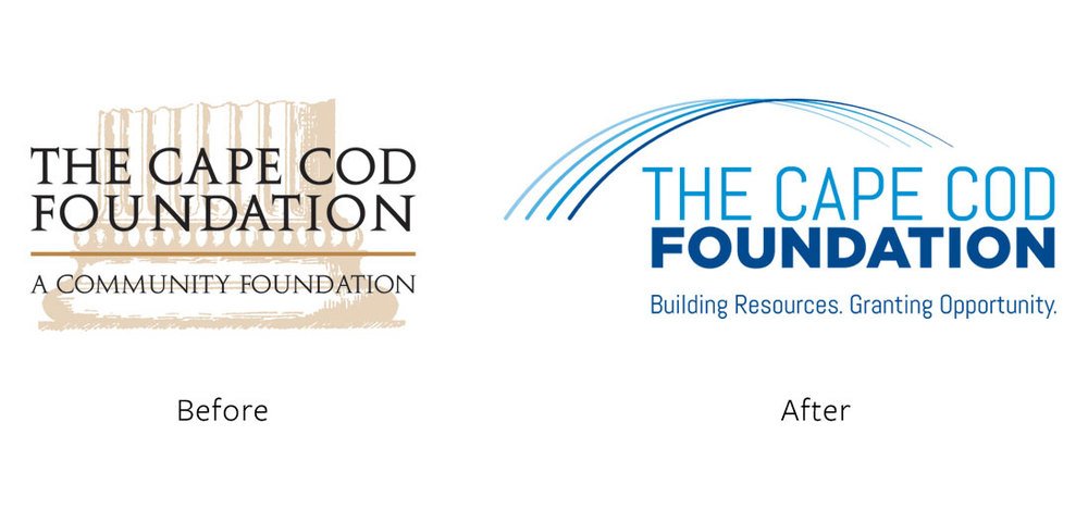
A modernized brand identity for The Cape Cod Foundation, a nonprofit organization dedicated to connecting donors with local initiatives. The redesign reflects the Foundation in a modern and sophisticated way.
The updated logo mark features parallel, gradated lines that subtly reference the Cape Cod bridge—a symbol of connection between grant givers and organizations in need. Paired with a modern sans-serif type treatment and a bold color palette, the refreshed identity establishes a contemporary and professional presence.
The new branding extends across stationery, trade show materials, social media, and marketing collateral, ensuring a cohesive and recognizable visual identity.


